Jaguar's reinvented logo has made the internet lose its mind
Rich Fowler•19 November, 2024
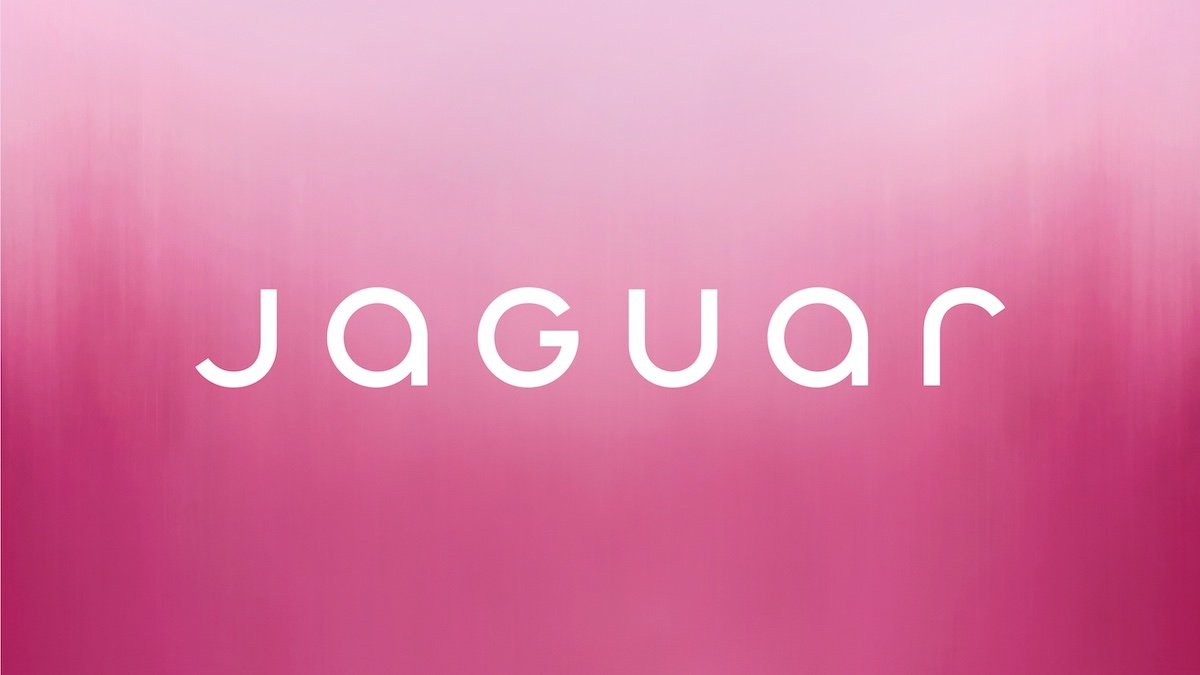
Jaguar's new logo claims to blend "upper and lower case characters in visual harmony" (Image: Jaguar)
The internet is losing its collective mind over the new Jaguar logo and brand direction.
The legendary manufacturer unveiled the new logo as part of its rebrand, which will act as a “fire break” as it moves towards becoming a fully electric luxury brand.
The new bespoke logo, written as "JaGUar", has "seamlessly blended upper and lower case characters in visual harmony" according to the company.
It debuts alongside a new "leaper" cat design embossed on brass and marketing slogans such as "Delete Ordinary", "Live Vivid" and, most notably, "Copy Nothing".
However, Jaguar brand enthusiasts and the general motoring press have savaged the shift from Jaguar's heritage. If Jaguar wanted a fresh start, it has it.
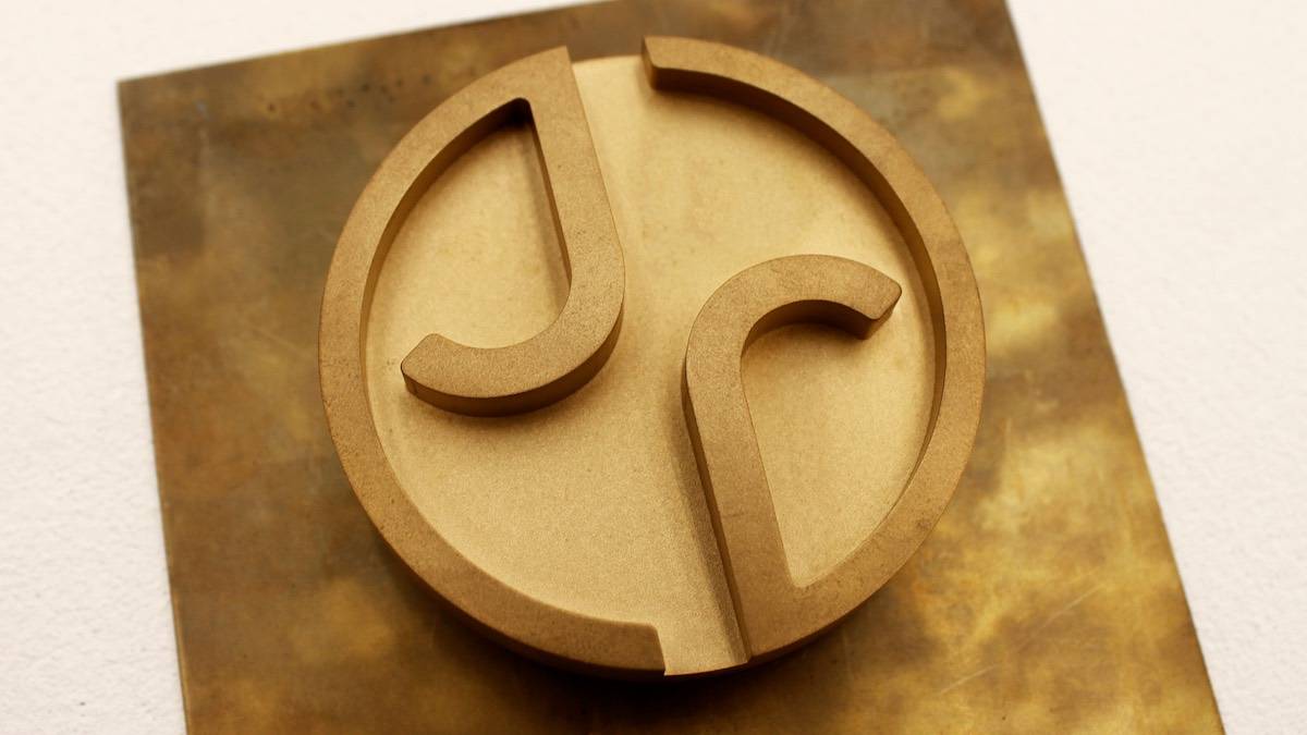
A new monogram is another part of the brand's new identity (Image: Jaguar)
Jaguar managing director Rawdon Glover said taking new cars off sale was "intentional" as it looked to create a barrier between the old models and the new-look Jaguars.
"From a marketing sense, at the moment, there are lots of people out there that know what Jaguar stands for, and actually it doesn’t stand for them, and we’ve seen that in terms of how they’ve responded to the offering that’s been in the market for the last 10 or 20 years," says Glover.
"We need to change people’s perceptions of what Jaguar stands for. And that’s not a straightforward, easy thing to do. So having a fire break in between old and new is, actually, very helpful."
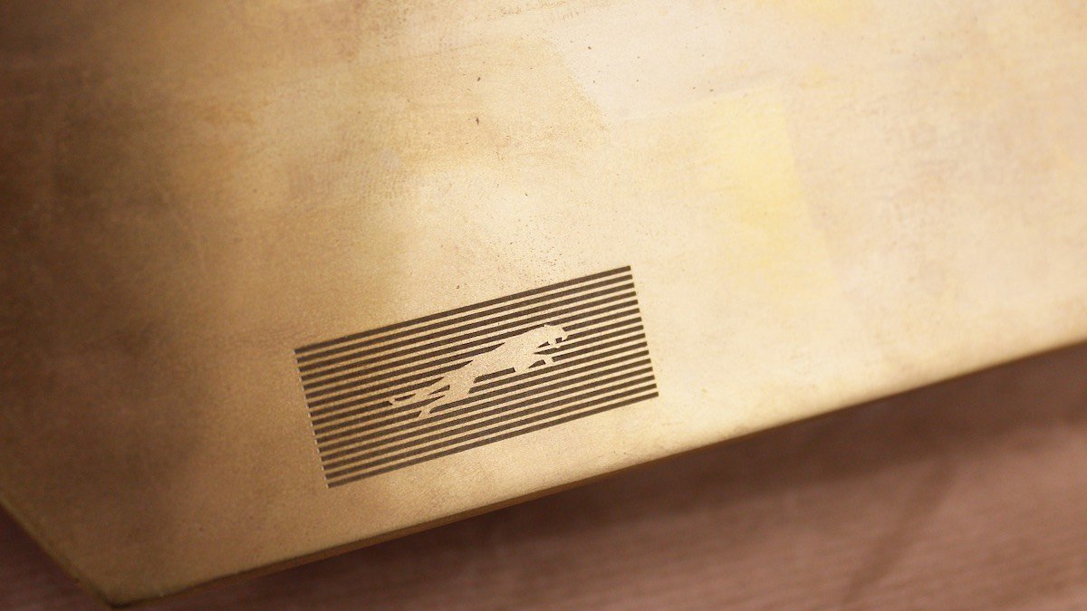
A new "leaper" cat design is another key part of the Jaguar rebrand (Image: Jaguar)
JLR’s chief creative officer Gerry McGovern added: "Jaguar has its roots in originality. Sir William Lyons, our founder, believed that 'a Jaguar should be a copy of nothing'.
"Our vision for Jaguar today is informed by this philosophy. New Jaguar is a brand built around Exuberant Modernism. It is imaginative, bold and artistic at every touchpoint. It is unique and fearless.
"We are creating Jaguar for the future, restoring its status as a brand that enriches the lives of our clients and the Jaguar community."
Jaguar also revealed its Strikethrough branding, 16 bold lines that will appear across its marketing and products, as well as a JR monogram and an "exuberant colour palette" which uses "red, blue and yellow" but "never flat colours".
How the internet has responded to Jaguar's new logo
It's safe to say that the rebrand has drawn the ire of Jaguar fans online, with commenters across the brand's social media accounts lambasting the new logo and brand identity.
One YouTube commenter claimed the teaser video was an example of "how to destroy your brand in 30 seconds".
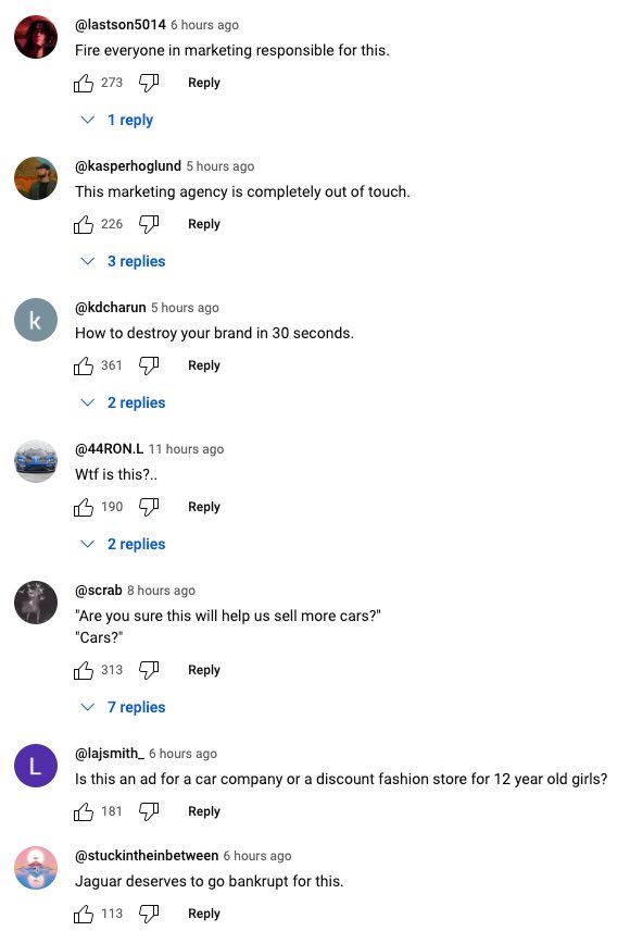
Feedback on the rebrand has not been positive in the comments section on Jaguar's YouTube channel (Screenshot: YouTube)
Another proclaimed: "This marketing agency is completely out of touch."
On Facebook, the response was no better. "Jaguar really has hit the self-destruct button", wrote one commenter. Another proclaimed that despite owning two Jags already, they'd no longer be a customer of the company.
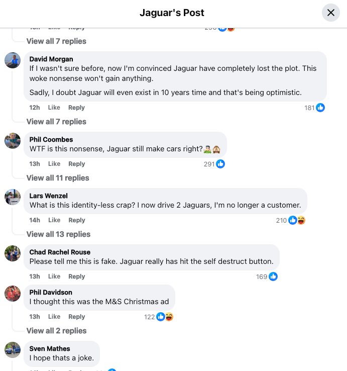
The feedback from Jaguar's Facebook followers was not much better (Screenshot: Facebook)
What's next in Jaguar's relaunch?
Jaguar's next move in its rebrand and relaunch is an exhibition called "Copy Nothing" which will debut at Miami Art Week on December 3, 2024.
The public installation will include what Jaguar describes as "the physical manifestation of its Exuberant Modernism creative philosophy, in a Design Vision Concept".
This Miami installation will include two "meticulously curated gallery spaces" which will include work by "new and ground-breaking emerging artists" who the brand sees as fitting with its new ethos.
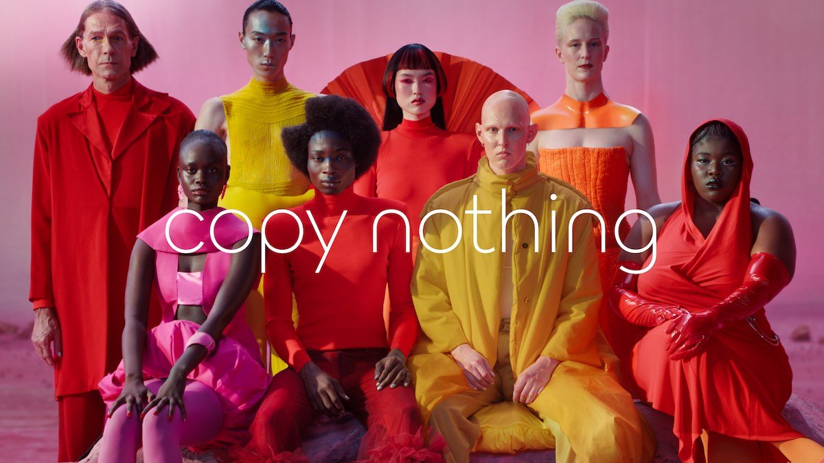
Jaguar claims the "Copy Nothing" ethos that's central to this new identity traces its roots back to the words of its founder, Sir William Lyons (Image: Jaguar)
Rich Fowler

Get The Latest
Sign up for the latest in retro rides, from stories of restoration to community happenings.
