British-based luxury car maker Bentley Motors has unveiled a new ‘Bentley Wings’ emblem that is a modern development of the original 1919 design by F. Gordon Crosby.
The new emblem was designed in-house by Bentley’s own design team under the watch of Director of Design Robin Page, and is the first step of a design and brand revolution at the British marque.
The new ‘Winged B’ is the fifth iteration of the logo in Bentley’s 106-year history and will be previewed with the reveal of a future vision concept car on 8 July, coinciding with the opening of a new Design Studio at its headquarters in Crewe, England.
The original ‘Winged B’ design was created by F. Gordon Crosby in 1919. Developments followed in 1931, the 1990s and 2002, but the new 2025 design is the biggest change to the instantly-recognisable mark in more than a century.
The new emblem has been revealed on the front of a new concept car, EXP 15, which Bentley says heralds the start of a new era of design language and, while not intended for production, gives a hint of the direction in which the brand is heading.
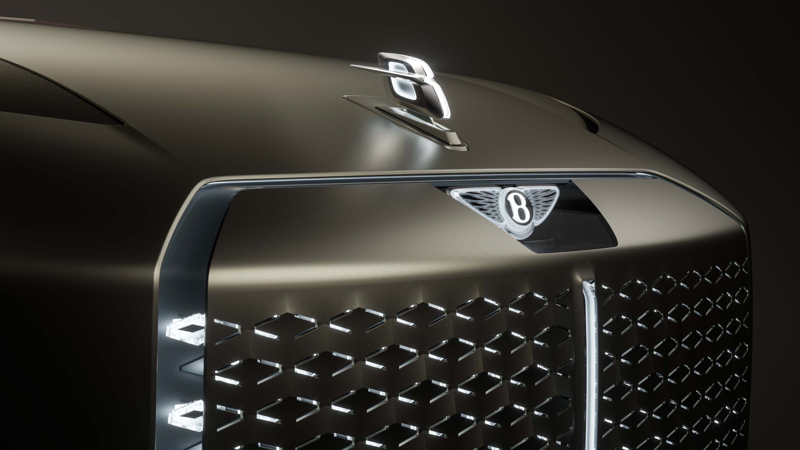
The new ‘Winged B’
The elements of the Bentley iconography have always been the same – a prominent B at the heart of the design, flanked by a pair of feathered wings.
The design of the new ‘Winged B’ began with an internal design competition which allowed the entire design team to submit concepts and sketches. The final design chosen was the work of Young Nam, a member of the Interior Design team, and that concept was then developed and detailed into the final version.
A statement from Bentley Motors said the mission in designing the new emblem was to capture some of the beautiful details from the previous designs – for example, the diamond pattern of the inner wings and the B ‘centre jewel’ – while also creating a more modern and progressive design.
The shape of the new wings is sharper and more dramatic than the outgoing version – more reminiscent of the angled wings of a Peregrine Falcon than the previous softer shapes. The lower feathers underneath the B have been removed entirely, for a visually-cleaner shape.
The centre of the wings retains the B centre jewel, but redesigned in such a way that the device can stand alone and be used as a graphic without the wings. The jewel has been redesigned to capture the high-quality details seen in luxury watch design, including a bevelled glass edge and chamfered metal surround, with a 3D depth of the ‘B’ below the surface.
The history of the ‘Winged B’
When W.O. Bentley started his car company in 1919, he needed an emblem that summed up his quest to push the boundaries of performance. He turned to his friend F. Gordon Crosby, the most famous motoring artist of the pre-war years, who brought distant motor races and continental tours to life for readers of The Autocar.
Crosby created the original Winged B – with the ‘B’ of Bentley inside a pair of wings chosen to represent the exhilaration of motion – and perhaps also a reference to W.O. Bentley’s background as a designer of engines for fighter planes in the First World War. Crosby gave each wing a different number of feathers to make it completely unique – and stay one step ahead of fraudulent imitations.
When Bentley passed into the ownership of Rolls Royce in 1931, a new emblem was created. This second iteration was symmetrical, with 10 straightened feathers each side, flanking a simpler ‘B’ in a plain black oval. This version is the longest-standing example in the company’s history, in use until the emblem’s third revision in circa 1996 – when, as a nod to Crosby the central ‘B’ was revised to echo the original, the emblem became more ornate and more pronounced curvature returned to the wings.
Following the purchase of Bentley by the Volkswagen Group in 1998, the emblem was redesigned again in preparation for the first Continental GT, launched in 2002.
For the new era of Bentley ushered in by the Continental GT – a car that took annual production from 1,000 cars to 10,000 – a new ‘Winged B’ was created. This honoured the 1919 original by reverting to an asymmetric design, with 10 feathers to the left an 11 to the right. This ‘Winged B’ has been in use ever since as the main identity of Bentley.